Headings/Buttons
Body Text
Additional Text Style
Headings/Buttons
Body Text
Additional Text Style
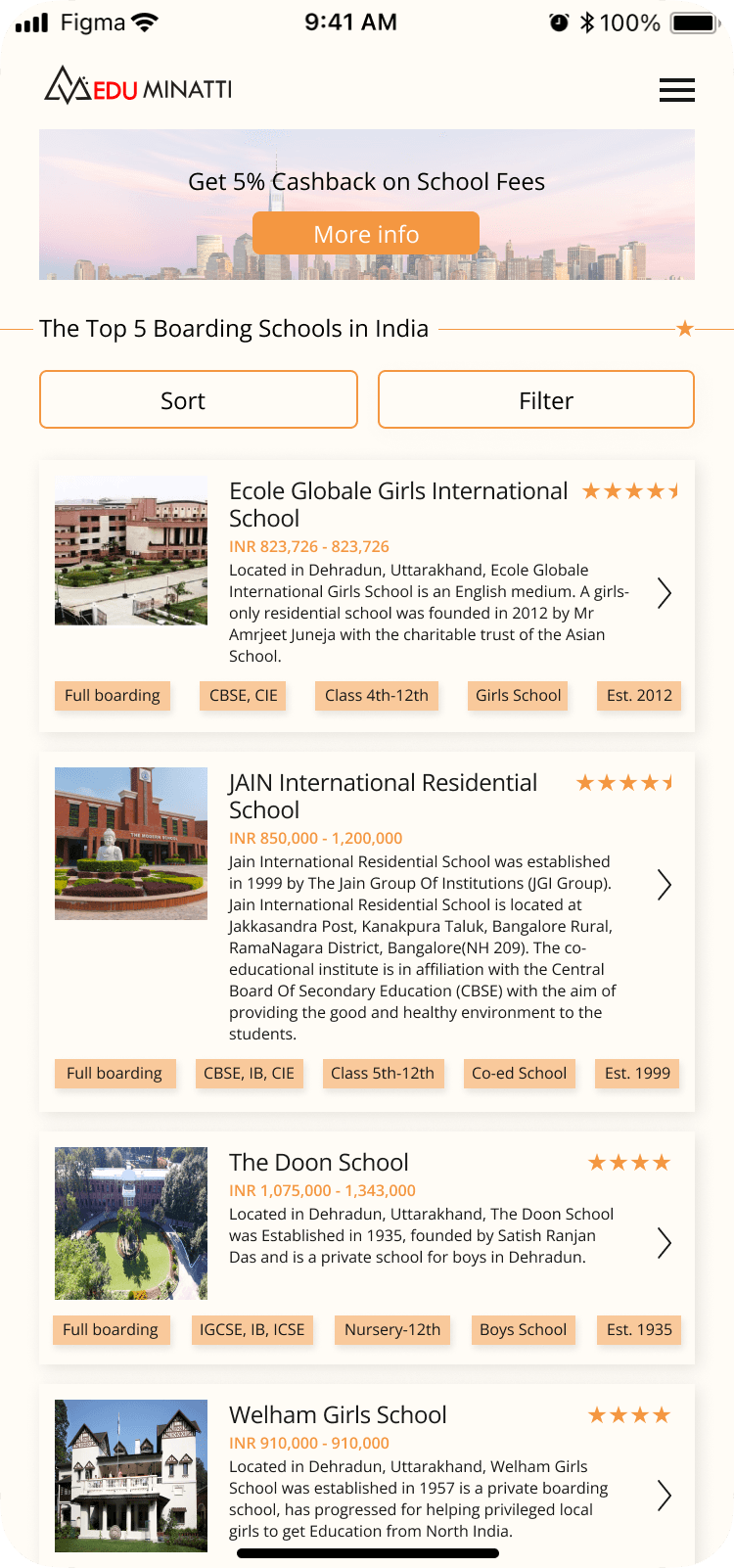
I learned how to follow an existing design style without having direct access to the design system file. This required me to closely observe and replicate the existing design elements, ensuring consistency across all devices.
Thank you for taking time out to check this project; I hope you enjoyed.
The task at hand
The process
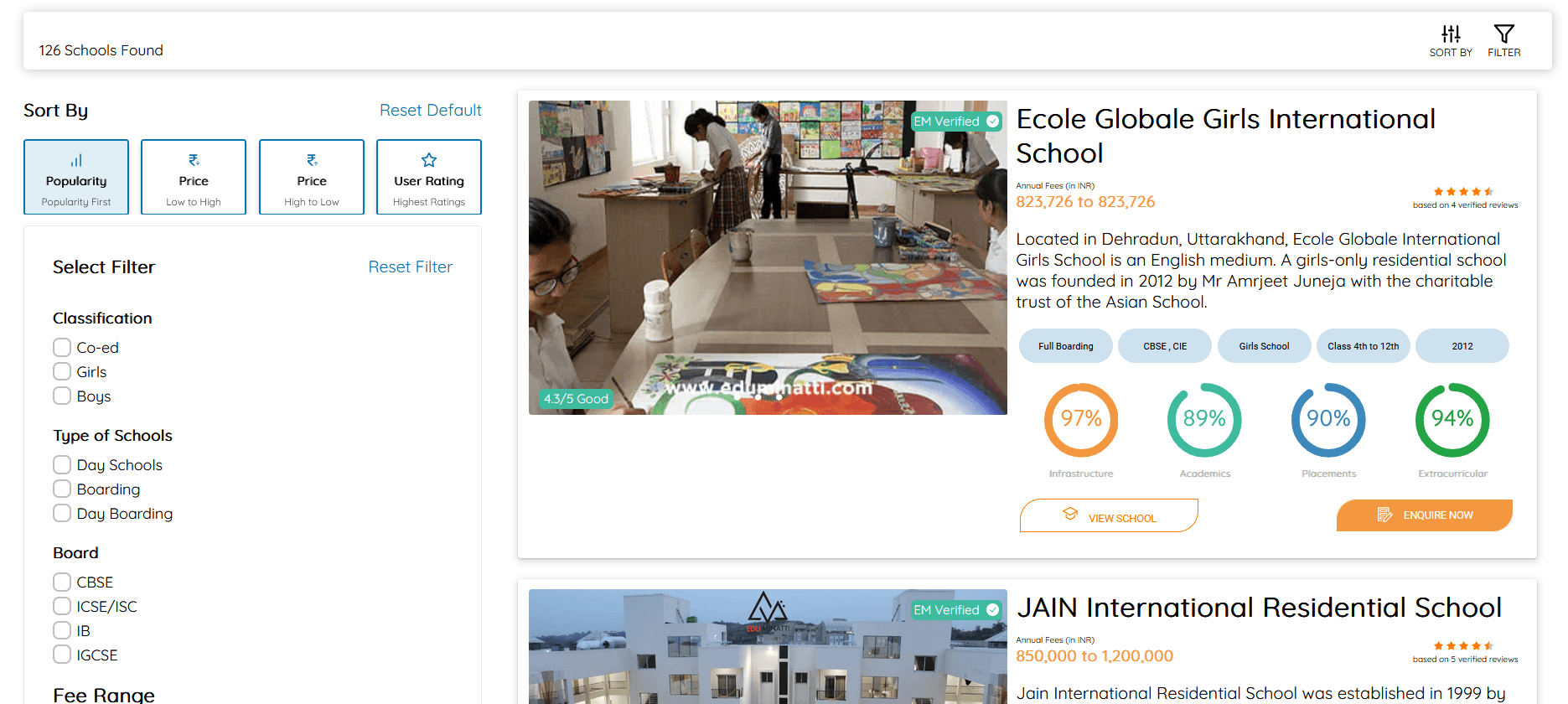
Eduminatti is a website where you can compare schools and colleges and choose the one that suites your preferences. Their website worked on desktop but was not designed for mobile.
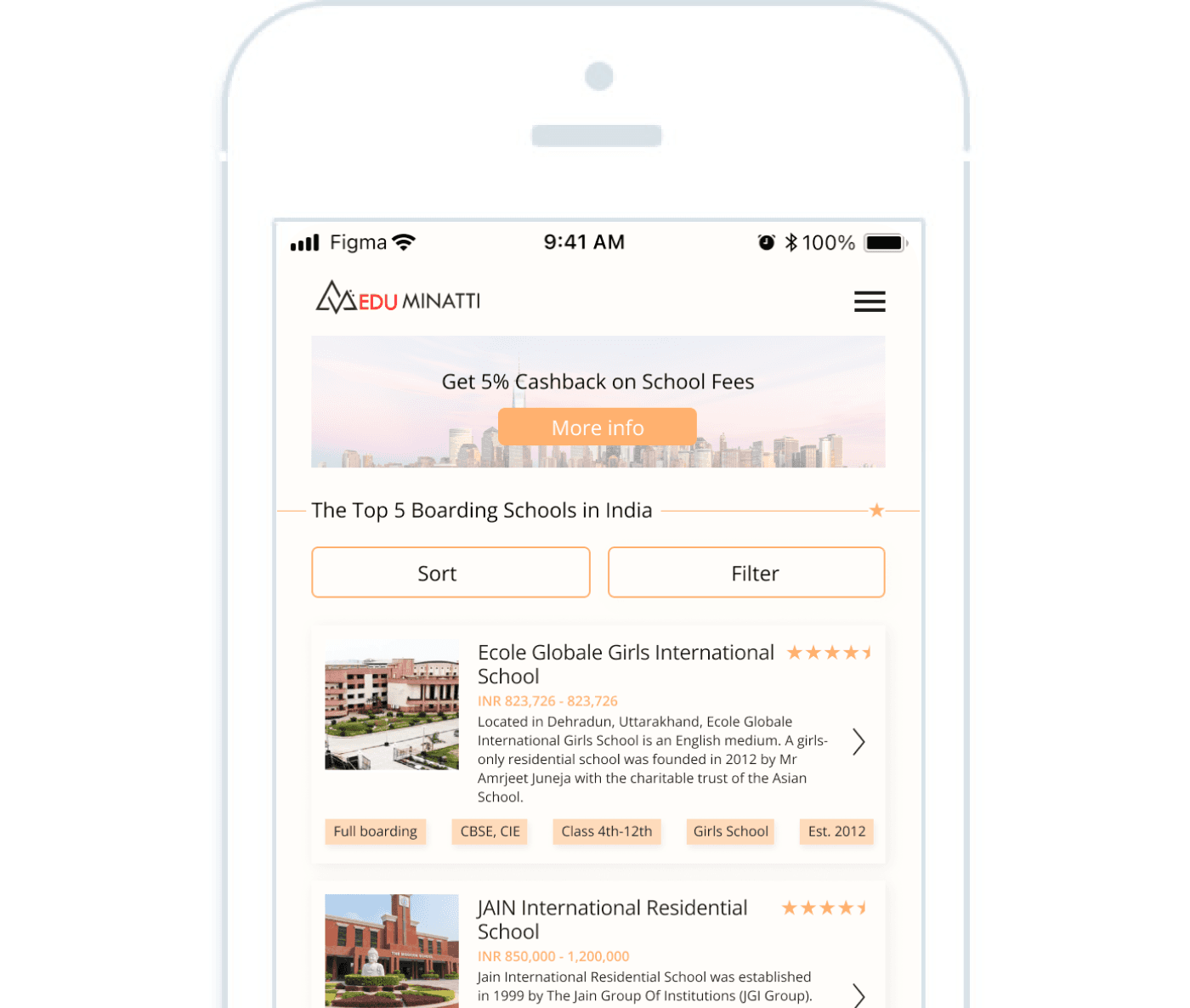
I redesigned their website to be responsive for mobile size screens.
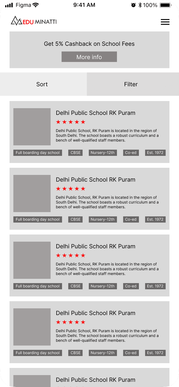
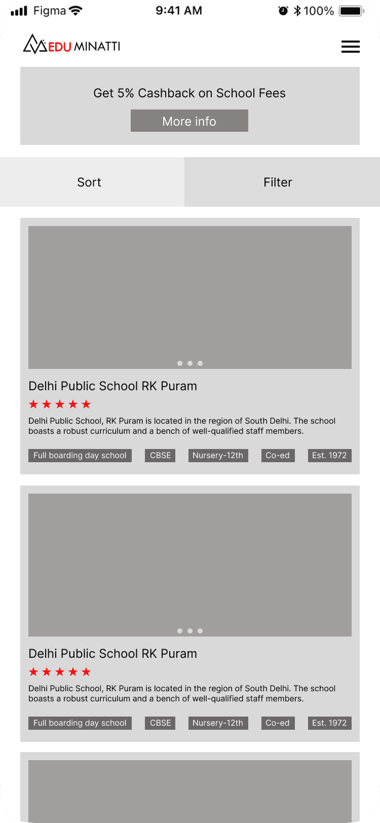
After obtaining their brand colors and typography, I designed a wireframe. I carefully picked out information that would be displayed on the first screen and left out some information to be displayed only after the user goes to check out a specific school. This was done due to screen size restrictions.
Following their design system, I designed the mobile version.
